the Den
Responsive Web Design
September 2022 to October 2022
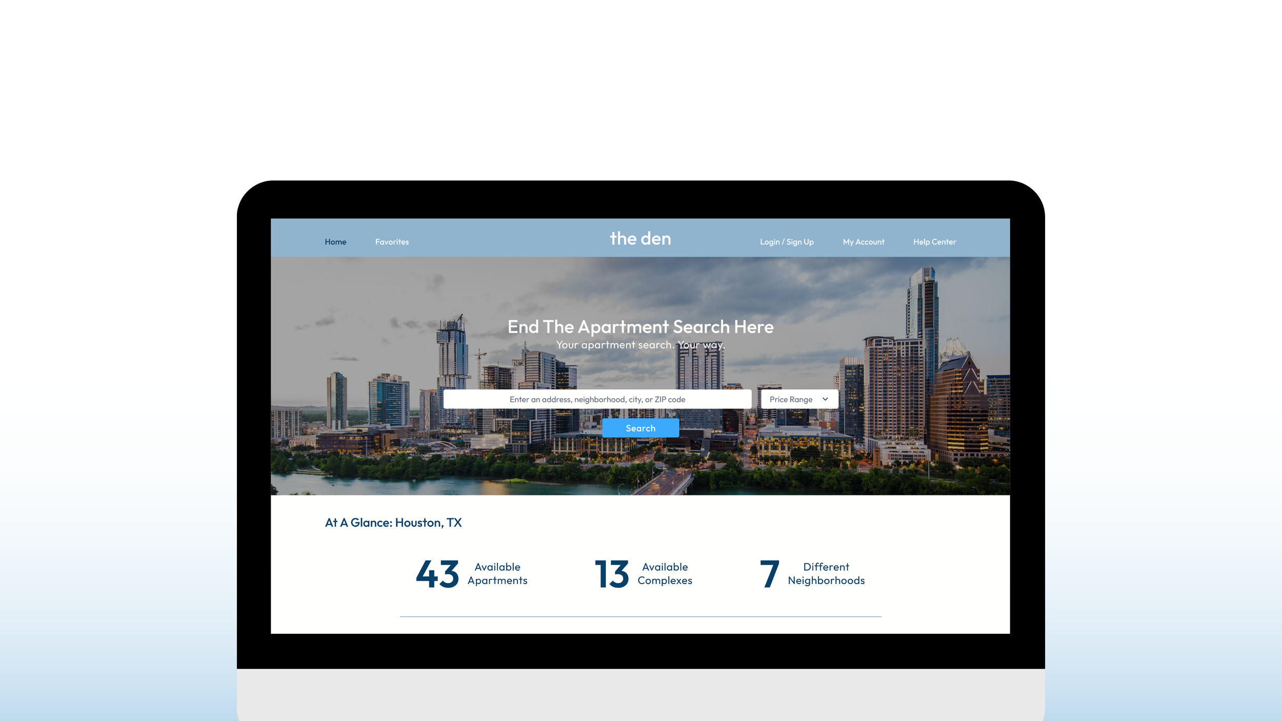
the den is a website that allows users to explore available apartments for rent based on a search location they set and user preferences. the den offers users a consistent layout to allow for comparison and simplified searching.
Project Overview
-
UX designer designing a website for the den from conception to delivery.
-
Conducting interviews, paper and digital wireframing, low and high-fidelity prototyping, conducting usability studies, accounting for accessibility, and iterating on designs.
-
the den users want a search platform that offers accurate pricing information and customizable search options.
-
Design a website for the den that allows users to search, browse, and compare available apartments in a set area.
Understanding the User
I conducted interviews to determine my users’ needs, likes, dislikes, and wants for a website for apartment searching. I then grouped their responses to create a persona that would be a part of my target audience. A primary user group was working adults who frequently use apartment-finding websites for an active apartment search or to gain an idea of their local market. Some of these users had successfully found an apartment on a website similar to the den in the past.
This user group confirmed my initial thoughts about what people would want from a website for apartment searching. Through my research, I gained that users would like clear information on pricing and contact information and more ways to filter their search options to find the perfect apartment.
Pain Points
Pricing
Certain apartment listings make it difficult for users to gain a better understanding of apartment pricing and fees
Photos
Users want to be able to see more photos that relate to the apartment they may be viewing during their search
Search Filters
Users want to have more control of their filters to help narrow their search
Persona
Kent Parsons
Kent is a civil engineer who needs an apartment-finding website that allows him to filter searches and find accurate pricing information because he wants to find an apartment that meets his needs and allows him to live closer to work and after-work activities.
Frustrations
Not being able to easily see accurate pricing for each type of unit
Filter options for amenities are not sufficient
Photos are not clear enough to give an accurate depiction of the apartment
Site Map
Usability Study Findings:
Users want the At A Glance section moved above the fold
Users would like to input their price range when initially searching for a city from the home page
Users liked having a map that could be toggled on and off on the Available Listings page
Users want a way to note that they have visited an apartment in-person
Users wanted a page to track what apartments they have visited or are scheduled to visit
What I Learned
While designing the Goldfinch Theater app, I learned how all the collected ideas from ideation to conception can add to the final iteration of the app. I learned how each idea is valuable while understanding which ideas would best fit the solution for the user's needs and problems.
Low-Fidelity Prototype
High-Fidelity Prototype
Desktop Mockups & Wireframes
Home
Available Listings – Map
Unit Listing
Favorites
Compare
Help Center
Phone / Tablet Mockups & Wireframes
Home (Phone)
Available Listings - Map (Phone)
Available Listings - List (Phone)
Unit Listing (Phone)
Favorites (Phone)
Compare (Phone)
Home (Tablet)
Unit Listing (Tablet)
Favorites (Tablet)
Compare (Tablet)


